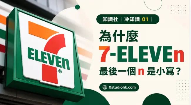
每天都會看見 7-ELEVEN 的招牌,但不少人直到今天才發現,品牌標誌中的「Eleven」最後一個字母竟然是小寫 n。這個細節並非印刷錯誤,而是品牌設計背後一段流傳已久的故事。
Millions of people recognize the 7-ELEVEN logo instantly, yet many never notice that the final letter in “Eleven” is a lowercase “n.” This wasn’t a printing mistake—it became one of the brand’s most recognizable design choices and has sparked curiosity for decades.
中文版本
如果仔細觀察 7-ELEVEN 的官方標誌,你會發現「ELEVE」都是大寫英文字母,唯獨最後一個「n」採用了小寫形式,形成「ELEVEn」的獨特設計。這個看似不起眼的細節,卻成為全球最容易辨認的品牌標誌之一,也是不少設計愛好者津津樂道的冷知識。關於這個設計,最廣為流傳的說法來自品牌早期的故事。相傳品牌創辦人的妻子認為,全部使用大寫英文字母會令整個標誌顯得過於生硬、嚴肅,缺乏親切感,因此建議將最後一個字母改為小寫。設計師採納了這個意見後,整個品牌標誌的視覺效果立即柔和不少,同時保留了鮮明的辨識度。雖然這個故事多年來一直廣泛流傳,但品牌官方並沒有正式證實這段歷史,因此不少人認為它更像是一段品牌傳說。然而,不論故事是真是假,這個小小的設計確實令 7-ELEVEN 與其他品牌有所不同。品牌識別設計的目的,不只是令標誌美觀,更重要的是令人一眼便能記住。一個細微的改動,有時比複雜的圖案更具效果。7-ELEVEN 最早源自美國,前身是一家售賣冰塊及日用品的小店,其後因營業時間由早上七時至晚上十一時而命名為「7-Eleven」。雖然今天全球大部分分店已經二十四小時營業,但品牌名稱一直保留至今,成為歷史的一部分。隨著品牌發展至全球多個國家和地區,這個帶有小寫 n 的標誌也從未改變,讓它成為品牌形象的重要元素。許多國際品牌都會在字體、顏色或字母排列上加入獨特細節,目的就是建立專屬的品牌記憶點,而 7-ELEVEN 的小寫 n 正是一個成功例子。很多人每天進入便利店購物,卻從未留意過這個設計細節;當第一次發現時,都會感到十分驚訝。這也證明,一個成功的品牌,不只是提供商品與服務,更會透過細節建立獨特個性,令消費者在潛移默化中留下深刻印象。
English Version
Take a close look at the official 7-ELEVEN logo and you’ll notice something unusual. Almost every letter in “ELEVEN” is uppercase, except for the final “n,” which appears in lowercase. It is a tiny design choice that millions of customers overlook, yet it has become one of the most recognizable features of the brand worldwide. A popular story explains how this happened. According to the widely shared tale, the wife of one of the company’s founders felt that using all capital letters made the logo appear too rigid and formal. She suggested changing only the last letter to lowercase, creating a friendlier and more approachable appearance without sacrificing the logo’s bold identity. Although this explanation has circulated for many years, the company has never officially confirmed it, leaving the story somewhere between history and corporate legend. Regardless of whether the tale is completely accurate, the design has proven remarkably effective. Successful branding often depends on memorable details rather than dramatic changes, and a single lowercase letter can make an enormous difference in visual recognition. The company itself began in the United States as a business selling ice and everyday household goods. Later, when its operating hours expanded from seven in the morning until eleven at night, the name “7-Eleven” was adopted. Even though most stores now operate around the clock, the original name remains as a reminder of the company’s early history. Over the decades, the logo has been reproduced on storefronts, product packaging, uniforms, advertisements, and digital platforms across dozens of countries. Throughout all those changes, the distinctive lowercase “n” has remained untouched, becoming an essential part of the company’s visual identity. Brand designers often spend years refining logos because even the smallest adjustment can influence how people perceive a business. In the case of 7-ELEVEN, one unexpected lowercase letter transformed an ordinary wordmark into a design remembered by generations of customers. Many people walk past the familiar green, orange, and red sign every day without noticing this subtle detail, and when they finally spot it, they rarely forget it again. It serves as a reminder that outstanding design is often hidden in the smallest details rather than the biggest ones.
總評
7-ELEVEN 最後一個小寫 n,也許只是品牌設計中的一個小細節,但正因這份與眾不同,令它成為全球最具辨識度的商標之一,展現品牌設計的真正力量。
Summary
Whether fact or legend, the lowercase “n” has become an unforgettable part of the 7-ELEVEN identity. It demonstrates how a single design decision can help create a lasting global brand remembered by millions.